Movie Poster Clichés – Duplicates
If you’re in charge of marketing a film sequel, the job of creating a poster needs careful consideration. The marketing for the original is already established and moving to far away from this could cause confusion. That said, it could come across as being lazy if you just copy the original one-sheet. It’s a tricky dilemma, and one many a film production has had to face. With that in mind, we are looking at those times when designers just said, “screw it, let’s just copy the original”. Here are 10 carefully selected series of horror posters that just copied its predecessors’ designs. Yep, here are… Movie Poster Clichés – Duplicates.
Critters + Critters 2
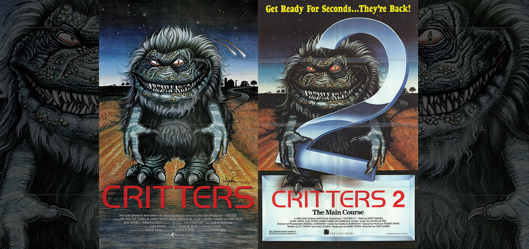
There is nothing more enjoyable than a well-designed, hand painted movie poster, and that’s exactly what Critters did, when it rocked up this glorious one-sheet featuring the a sharped fanged “Crite”, set against starry night sky over the rural Kansas farm setting of the film.
Critters 2 just takes the same poster and plonks a large metallic number 2 on top. You do have to give credit to the artist for painting the number in the hands of the Crite, and for the extra shadow and shading where its leg hangs down the new title slab. But this poster has had as much thought into it as I spend picking my socks in the morning, almost none!
Friday the 13th + Friday the 13th Part 2
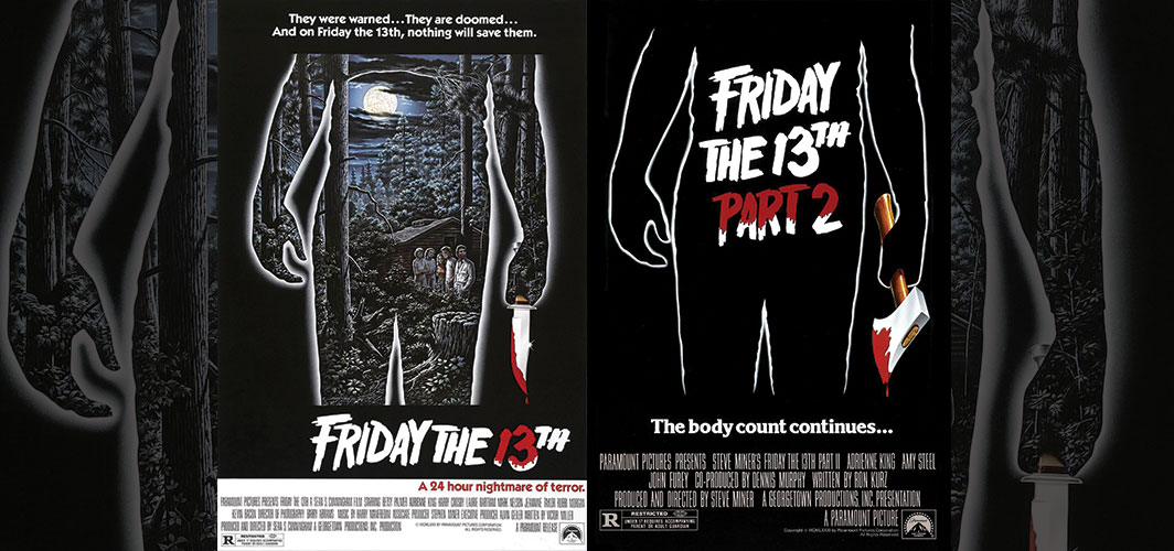
The original poster for Friday the 13th shows a shadowy silhouette of the films killer set against a cabin in the woods. Interestingly enough, the first one sheet did not include the five badly drawn characters, that were hastily added at a later date. The Killers hand is clenched around a bloody knife.
For Friday the 13th part 2, the designers have used the same silhouette, but the knife is now an axe and the woodland scene has been replaced with the films title. All the most interesting parts of the original poster have been removed, making this design extremely tasteless. More thought has gone into the design of a shop branded cereal box.
Fright Night + Fright Night Part 2
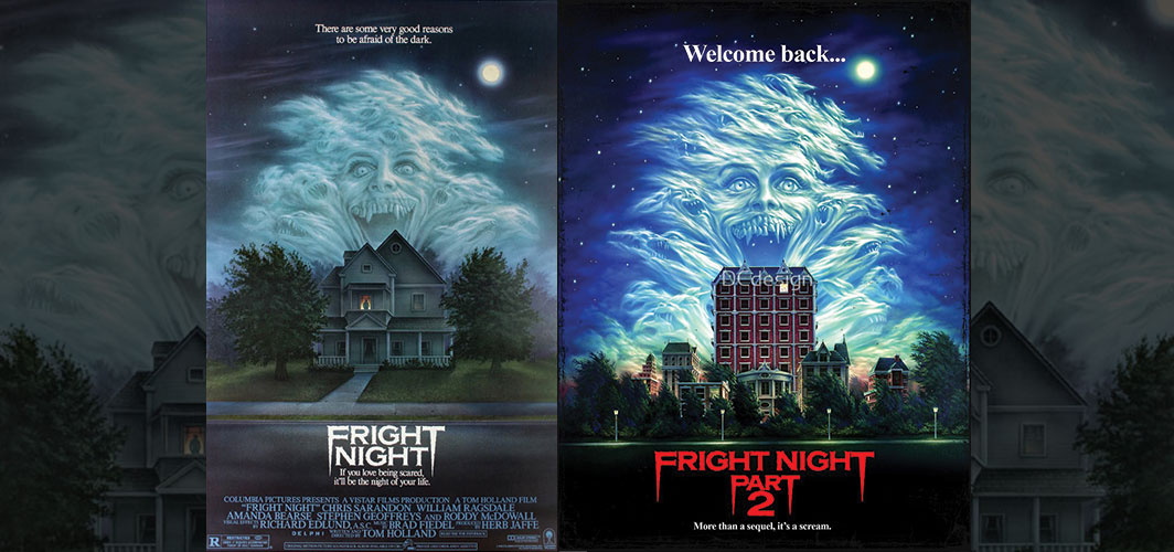
Fright Night is one of my favourite 80’s horror films, and the story of a boy discovering that a Vampire has moved in next door is a fantastic twist on the classic vampire formula. The poster is a wonderful illustration, depicting the vampire version of Amy, as an ominous cloud formation above Jerry Dandrige’s house. It’s creepy and atmospheric and it certainly one of the posters that had a huge impact on me as a kid.
With such a wonderful illustration in place for the first film, it’s surprising that the designers didn’t just re-use the old poster, as many of the films on this list did, for its sequel. The new poster was completely re-painted but using the same concept and elements. Amy’s cloud like head is still in place, despite not being in this film, but it now looks more cartoonish rather than the more portrait version in the original. The house is replaced with a block of flats to mirror the change of location in the film. It’s a poor parody of the original one-sheet and one much less scary too.
Ghoulies + Ghoulies II
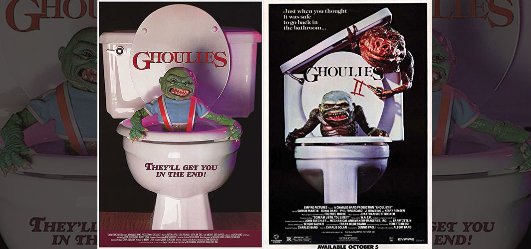
There has always been something quite provocative about the Ghoulies poster. Maybe it’s the nature of the composition, with the Fish Ghoulie climbing from a toilet, or maybe it’s the stark contrast of the white, green and black pallet, but it feels artier than your standard poster. It’s certainly one of those rare 80’s posters that uses a posed photo rather than an illustration.
For Ghoulies II, the designers decided to go with the same concept but with the addition of the Toad Ghoulie climbing out of the cistern. Once more, it’s a posed picture, but eagled eyed fans will notice that it’s a completely different toilet. Did the designer give a crap about this one…? They literally did, in the form of a great big green turd! (sorry Fish, you were always my favorite!)
The Fly + The Fly 2
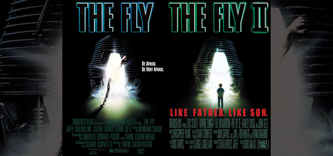
David Cronenberg’s nightmarish version of French-British writer George Langelaan’s book of the same name, The Fly, is a grim tale of techno horror, where brilliant Scientist Seth Brundle manages to bind his genes with that of a house fly. The poster depicts the method in which this accident happens, with one of Brundle’s teleportation pods eerily illustrated on the cover. It has a creepy Alien vibe, as the darkness of the picture is broken by a green glow from inside the pod. A giant fly leg and human hand are climbing out from inside.
The poster for Fly 2 is another great illustration, using the the same composition, but the leg and arm are now replaced with Bundle’s hybrid son.
House + House 2
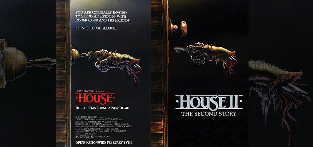
The Sean S. Cunningham produced classic House has a rather simple but effective poster, that depicts a rotting hand ringing a doorbell. It’s the level of detail on the hand that makes it pretty creepy, with bone, sinew and even worms, creating a horrific helping of horror.
House 2 continues this theme, but with a brand-new illustration of a hand clutching a key. The hand is clearly a representation of the original, but it’s surprising to see that despite copying the bones, gore and worm from the original, the designer has dialled back on the decomposition of the fingers. Here there is less bone on view. It would have been cooler if it had gone the other way, with the hand becoming rottener as the film series went on!
A Nightmare on Elm Street 3 + 4 + 5

We all had many a sleepless night after watching A Nightmare on Elms Street, and the horror of the films have always been perfectly captured by the film’s posters, even if they are abstract versions of the films they represent. The third, fourth and fifth film posters are some of the crazier design and they share two common design elements, Freddy’s head and claws.
You’ll notice that the composition on each of the designs represent Freddy Kruger as floating head, raised high above the “dreamers” below. This height designates Freddy as being more powerful or even god like within his dream world. Whilst below everything else, Freddy’s clawed fingers cradle the world he has created. Freddy also has a weird floating eye, giving him a supernatural vibe. Whilst each image is unique, they all share these common quirks.
Salem’s Lot + Return to Salem’s Lot
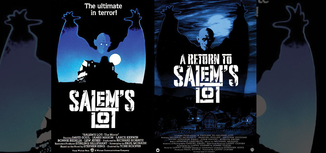
Salem’s Lot is a film/TV-mini series (depending if your from the UK/USA) based on the book by Stephen King. The chilling story of a small town slowly taken over by vampires is a chilling tale of morality and loss and has one of the most distinct vampires ever placed to bare his ugly head on screen, Mr Barlow. It’s Barlow that appears on the original poster, his arm spread high above the sleepy little town below.
For the sequel, Return to Salems Lot, which was written for the screen, the poster uses the same image of Barlow, but this one is much more detailed. This probably means that the images used in both posters is a still of actor Reggie Nalder as Mr Barlow, though I can’t say I’ve ever seen him in this specific pose!
Tremors Series
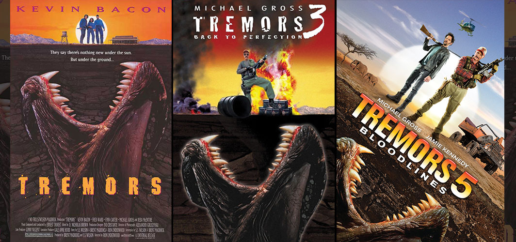
The Tremors films are a series of features following a bunch of underground (and sometime flying) creatures with an insatiable appetite. Despite the sillier nature of the films, the posters are always fun to look at. What I’ve always loved about the original Tremors poster, is how clever it is. There is a certain amount of control going on here, with the designers wanting to show the creature, but without spoiling the film. It does that by exposing the danger but without revealing too much to the audience. That monster that is about to pop out of the ground is not one of the “Graboids” but one of its tentacles. And whilst Tremors 2, 4 and 6 breaks with this imagery, the rest of series all feature this emerging tentacle.
The other common trait for the series, is the creature’s position underneath the main cast members. The poster tells us all you need to know about the “Graboids”, they are under your feet. The original poster is certainly designed to be homage to one of the other films on our list, the classic poster for Jaws.
Jaws Series
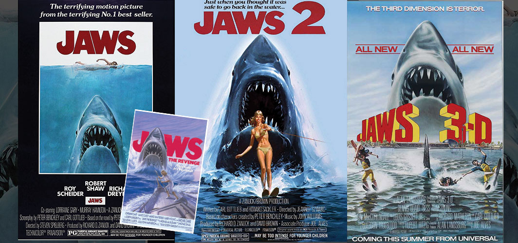
Jaws has one of the most iconic posters ever designed. And why not! It is, after all, the film that triggering the reign of the summer blockbuster. It’s only fair that it has one of the most recognisable posters ever created.
Paul Bacon, one of the foremost book illustrators of the 20th century, was the man responsible for the original concept of the shark and swimmer. He created a black and white image that adorned an early version of the book, depicting the pretty gruesome death of Chrissie Watkins. When the book was republished, artist Roger Kastel updated the shark, giving birth to one of the most terrifying images ever. When the film came around, they literally took the oil-on-board painting and transformed it into the film’s poster. The posters composition, at the hands of some unknown graphic designer, really shows off some clever techniques. The use of the muted blue helps to contrast against the rest of the picture, especially again the large red all caps title, which instantly draws your eyes. But the cleverest part is the large black border (later blue), that confines all that information into a small space, adding a sense of claustrophobia.
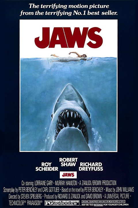
The imagery of the shark coming up from the depths, poised to attack the swimmer, tells you all you need to know about the films plot, whilst leaving you salivating to find out what happens next. It’s not trying to explain the whole movie, or ruin any scenes, it simply portrays the films main theme: Big scary shark!
With such a strong promotional tool at the studios command, future films also adopted the same image. Jaws three and four just used the exact shark image, albeit with a few location changes to reflect the films plot. Jaws two was completely repainted, hence why the shark looks slightly longer, thinner and with a much wider mouth.
The Jaws one sheet has gone onto be one of the most influential posters ever created, with many films, TV shows and magazines parodying the imagery, cementing the killer shark as one of the greatest icons of cinema.
The Fallout Collection: Top 10 Films of Nuclear Devastation
Top 10 Nuclear War Films the show the stark realities of a world after fallout
10 Classic Songs Reimagined for Dramatic Film Trailers
Looking at classic songs in recent movie trailers, a trip down memory lane!

Halloween 2023 – Hidden Movie Challenge
Can you uncover all 31 of these horror titles hidden in this spooky scene?
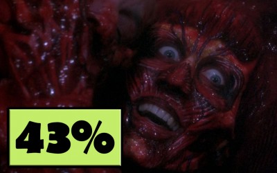
Hellbound : Hellraiser 2
Don’t Hesitate!
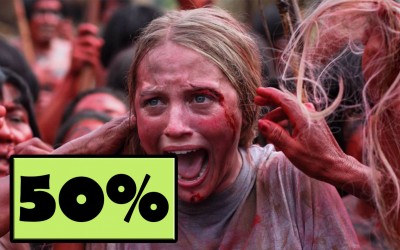
The Green Inferno
What’s Eating You?

The 10 Most Infamous Houses in Horror
Step Inside the Nightmare! Here’s a terrifying list of houses from horror films sure to creep you out
Top 20 Horror Goth Characters in Film
Looking at the subculture and influences on film and beyond with our top twenty gothic characters
10 Deleted Horror Scenes That Have Never Been Released
Looking at 10 scenes that you may never get to see!
Keep Rotten”