Box Art vs Reality
Back in the good old day of film, we would visit a video store in order to watch movies. Films were too expensive to buy and renting was the only option we had. Most of the films never made it to the cinemas, so trailers and poster went pretty much unseen. The only way we could judge a film was by its cover, and not every film was honest with it’s representation of its films content. The VHS box art was often something that would catch your eye, but you always found yourself sceptical of its dramatic depiction of the films events. I wanted to look at a random selection of box art, and find the good and bad illustrations that were used to sell us films. Box Art vs Reality
Blood Beach (1981)
Verdict : BAD
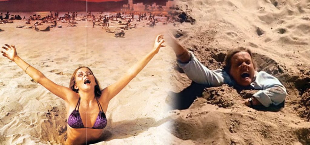
The poster depicts a bikini clad beauty dramatically being pulled under the sand, but the closest we get to this scene is an older dog walker who falls foul at the start of the film.
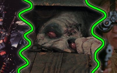
Creepshow (1982)
Verdict : GOOD
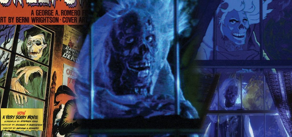
We have a skeletal creature at a window, wearing a cloak and looking pretty creepy. Yep both the poster and film seem to have caught this well. The Poster creature does have a missing eye and long claw like fingernails, but we can forgive those missing details, because the film’s villain is just nightmare fuel!
Critters (1986)
Verdict : GOOD
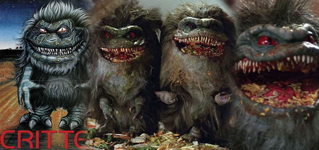
Despite a slight exaggeration of the Critters features and claws on the poster, the artist has managed to capture the Critter in all it’s full fury glory.
The Evil Dead (1981)
Verdict : GOOD
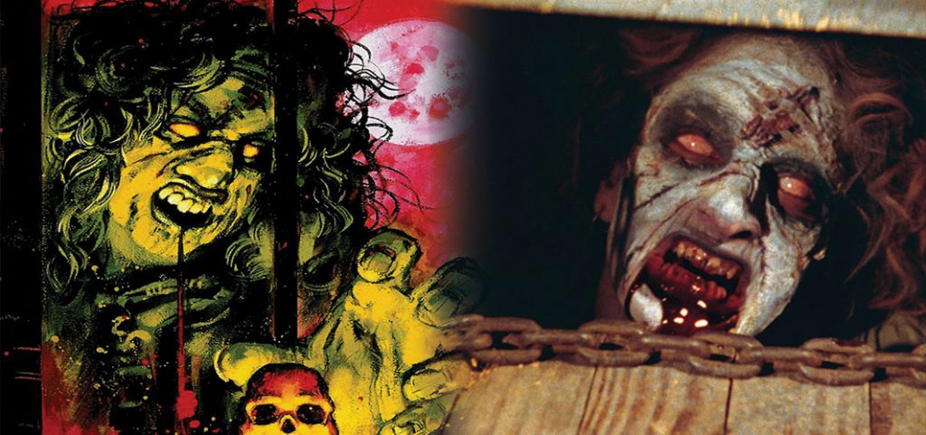
It’s hard to mistake poor Cheryl’s ugly undead mug on the front of the Evil Dead box. Even with a colour pallette change, her white eyes and bandaged forehead are film accurate, even down to the scratches on her face.
From Beyond (1986)
Verdict : GOOD
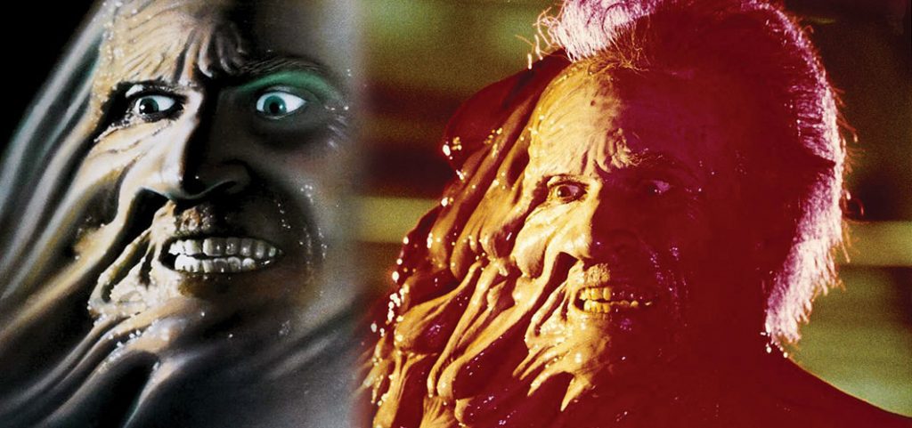
Dr. Edward Pretorius deformed face features on the box of From beyond. It’s a very accurate illustration taken from one of the scenes in the film. The poster actually holds back the full horror of Pretorius’ mutation.
Ghosthouse (1988)
Verdict : BAD
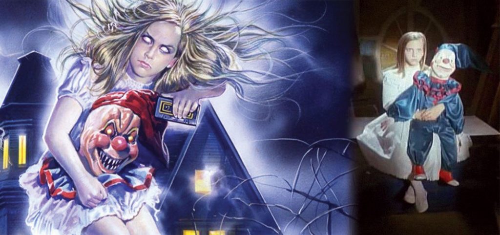
The boxart of Ghosthouse shows a blond hair spectre, surrounded by swirling energy, cradling a sinister severed doll’s head. The films spook is much less scary, appearing as a brunette girl with a large doll. The doll does get some fang action a little later on, but the girls dramatic stormy hair and white eyes only appears in the illustration.
The Kindred (1987)
Verdict :BAD
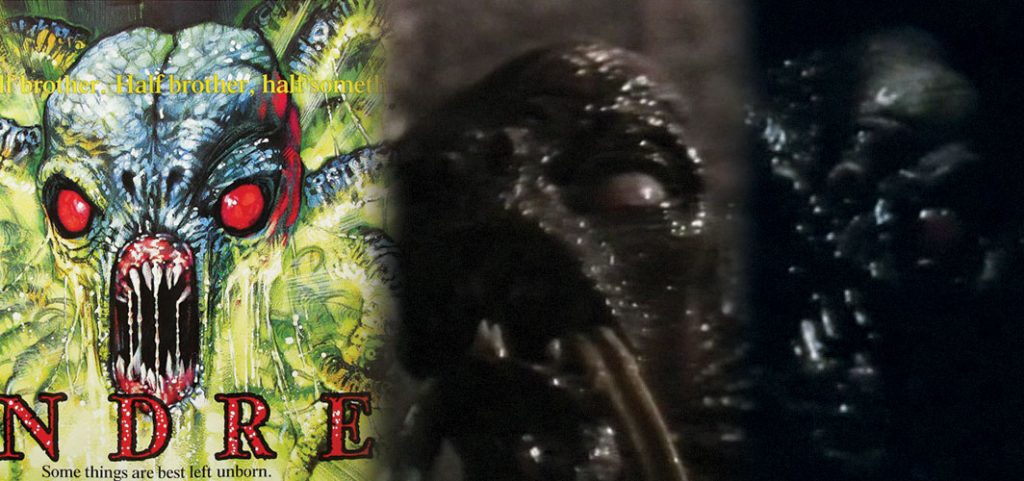
The creature that features on The Kindred’s box looks like an alien octopus from hell. The films creature is a guy in a suit. Yes, ok it does have a few tentacles and it does look a little like the illustration, but the bright colours fails to depict the brief and dark glimpse that we get in film.
Seedpeople (1992)
Verdict : GOOD
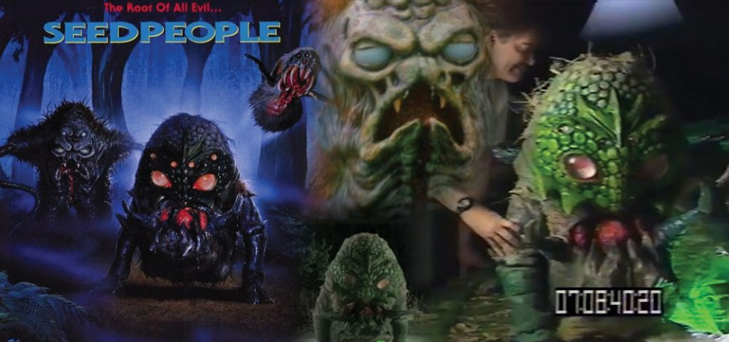
The creatures that appear on the box for Seedpeople, appear to be an accurate representation of their onscreen counterparts. Despite a dramatic palette change that makes them appear more menacing and less plastic looking, they do accurately exhibit the films content.
Street Trash (1987)
Verdict : BAD
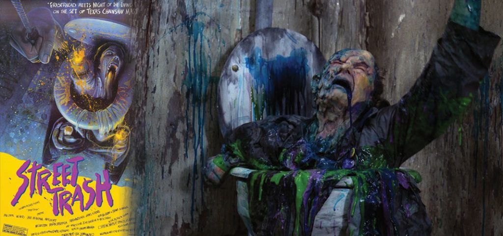
Street Trash is a messy over the top film, and it’s no surprise that the film’s content is actually much more gruesome than it’s box art depicts. The artist clearly knew what was happening in the scene, they went for a much cleaner and yellow design, whereas the film used as much coloured goo as they could.
The Video Dead (1987)
Verdict : BAD
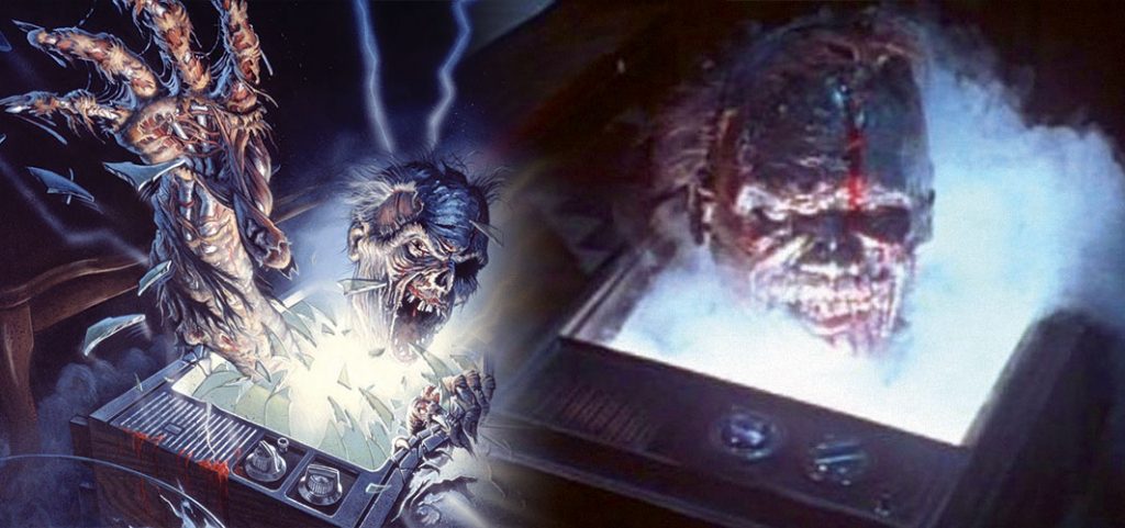
A zombie crashes out from a television, it’s cold rotting hands reaching out towards you. Sadley, for the Video Dead, that’s about as exciting as it gets, because the film scene that the box art depicts is less dramatic. On film, dry ice pours out from a tv as a head slowly rises from below. The zombie has both it’s eyes and nose and it never opens its mouth. The illustration really exaggerates the activity that happens in film.
Would you like too see more boxart comparisons? Drop us your suggestions in the comments below and we will make your nightmares comes true! (mwawhahahah)
Other Articles

21st Century Scream Queens
A look at the next generation of scream queens destined to go down in horror history.

Horror Films Based on Folklore and Mythology Around the World
Looking at the scariest tales from around the world.
The Fallout Collection: Top 10 Films of Nuclear Devastation
Top 10 Nuclear War Films the show the stark realities of a world after fallout
Movie Reviews
Hellbound : Hellraiser 2
Don’t Hesitate!

The Green Inferno
What’s Eating You?
RECENT REVIEWS
Hellbound : Hellraiser 2
Don’t Hesitate!
The Green Inferno
What’s Eating You?

Turbo Kid
Smashing Gnome Sticks!

Krampus the Christmas Devil
Ho Ho NO!
Recent News
11 Scariest Basement Scenes in Horror
Terror from below!

Boba Fett Won’t Appear in ‘The Mandalorian’
No bounty for you!
The Kindred poster is a striking example of how a film can over sell itself. The films creature left little impression on me, but the films cover art is something I know and remember very well. But out of all these examples, Blood Beach is most guilty for overselling, with the films cover art just outright lying about the films visuals.
Ghoulies!